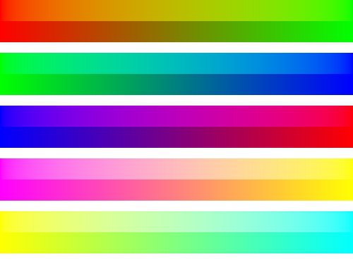
The image below shows the difference between gradients calculated in linear (top gradient) and sRGB space (bottom gradient). Note how direct interpolation on the sRGB values yields much darker and sometimes more saturated looking images.
Just going by the looks, one might prefer the look of the sRGB-space versions, especially for the last two. However, that’s not how light would behave in the real world (imagine two coloured light sources illuminating a white wall; the colours would mix as in the linear-space case).