


D
Size: a a a
2021 November 24
D
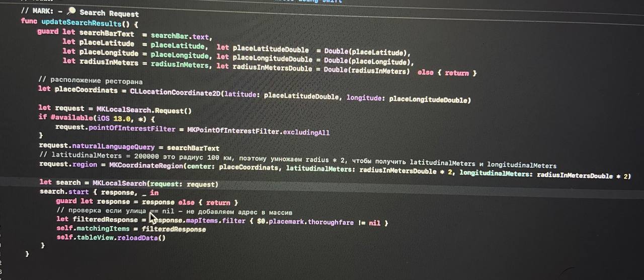
class AvatarButton: UIButton {
private var status: UIView = UIView(frame: .zero)
private let emptySpaceMargin: CGFloat = 3.0
private let statusDiameter: CGFloat = 14.0
var statusBorderColor: UIColor = Style.Color.controllerBackgroundColor {
didSet {
self.setNeedsLayout()
}
}
var userStatus: UserStatus = .none {
didSet {
switch userStatus {
case .online:
status.backgroundColor = Style.Color.switchThumbOnTintColor
case .ofline:
status.backgroundColor = Style.Color.selectedItemColor
default:
status.backgroundColor = Style.Color.titlePaleForegroundColor
}
}
}
override init(frame: CGRect) {
super.init(frame: frame)
self.setupUI()
}
required init?(coder: NSCoder) {
super.init(coder: coder)
self.setupUI()
}
override func layoutSubviews() {
super.layoutSubviews()
self.setupLayers()
}
func setupLayers() {
guard let image = imageView else {
return
}
imageView?.layer.cornerRadius = image.bounds.width / 2.0
imageView?.layer.masksToBounds = true
self.status.layer.cornerRadius = self.status.bounds.width / 2.0
self.status.layer.masksToBounds = true
self.status.layer.borderWidth = emptySpaceMargin
self.status.layer.borderColor = self.statusBorderColor.cgColor
}
func setupUI() {
self.backgroundColor = .clear
status.backgroundColor = .gray
self.translatesAutoresizingMaskIntoConstraints = false
self.addSubview(status)
self.status.translatesAutoresizingMaskIntoConstraints = false
self.status.centerXAnchor.constraint(equalTo: self.trailingAnchor, constant: -2).isActive = true
self.status.centerYAnchor.constraint(equalTo: self.bottomAnchor, constant: -2).isActive = true
self.status.widthAnchor.constraint(equalToConstant: statusDiameter).isActive = true
self.status.heightAnchor.constraint(equalToConstant: statusDiameter).isActive = true
self.imageEdgeInsets = UIEdgeInsets(top: 0, left: 0, bottom: 0, right: 0)
}
}
АЛ
Не вижу в этом ничего такого
АЛ
Может я чего-то не знаю
АЛ
Зачем придумывать велосипед, если все и так есть