import styled from "
@emotion/styled/macro";
const Wraper = styled.div`
width:566px;
height:32px;
border: 1px solid rgba(0, 66, 105, 0.28);
border-radius: 4px;
padding:8px 14px;
`;
const ItemList = styled.ul`
align-items:center;
margin:0;
padding:0;
`;
const Item = styled.li`
display: inline-flex;
align-items: center;
height:30px;
background-color:rgba(0, 66, 105, 0.07);
border-radius: 4px;
padding-left:12px;
list-style-type: none;
`;
const ItemContent = styled.span`
color:rgba(0, 57, 92, 0.8);
`;
const Close = styled.a`
display: inline-block;
cursor: pointer;
width:28px;
left: 14px;
`
const DateSelector = styled.div`
width: 594px;
height: 188px;
border: 1px solid rgba(0, 66, 105, 0.28);
margin-top:12px;
overflow-y: scroll;
`
const SelectCheckmark = styled.span`
position: absolute;
top: 0;
left: 0;
height: 25px;
width: 25px;
background-color: #eee;
`
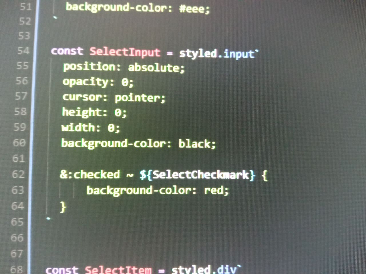
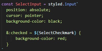
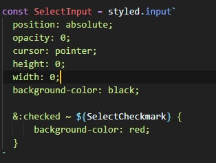
const SelectInput = styled.input`
position: absolute;
opacity: 0;
cursor: pointer;
height: 0;
width: 0;
background-color: black;
&:checked ~ ${SelectCheckmark} {
background-color: red;
}
`
const SelectItem = styled.div`
display: block;
position: relative;
padding-left: 35px;
margin-bottom: 12px;
cursor: pointer;
font-size: 22px;
user-select: none;
&:hover{
${SelectCheckmark}{
background-color: #ccc;
}
}
`
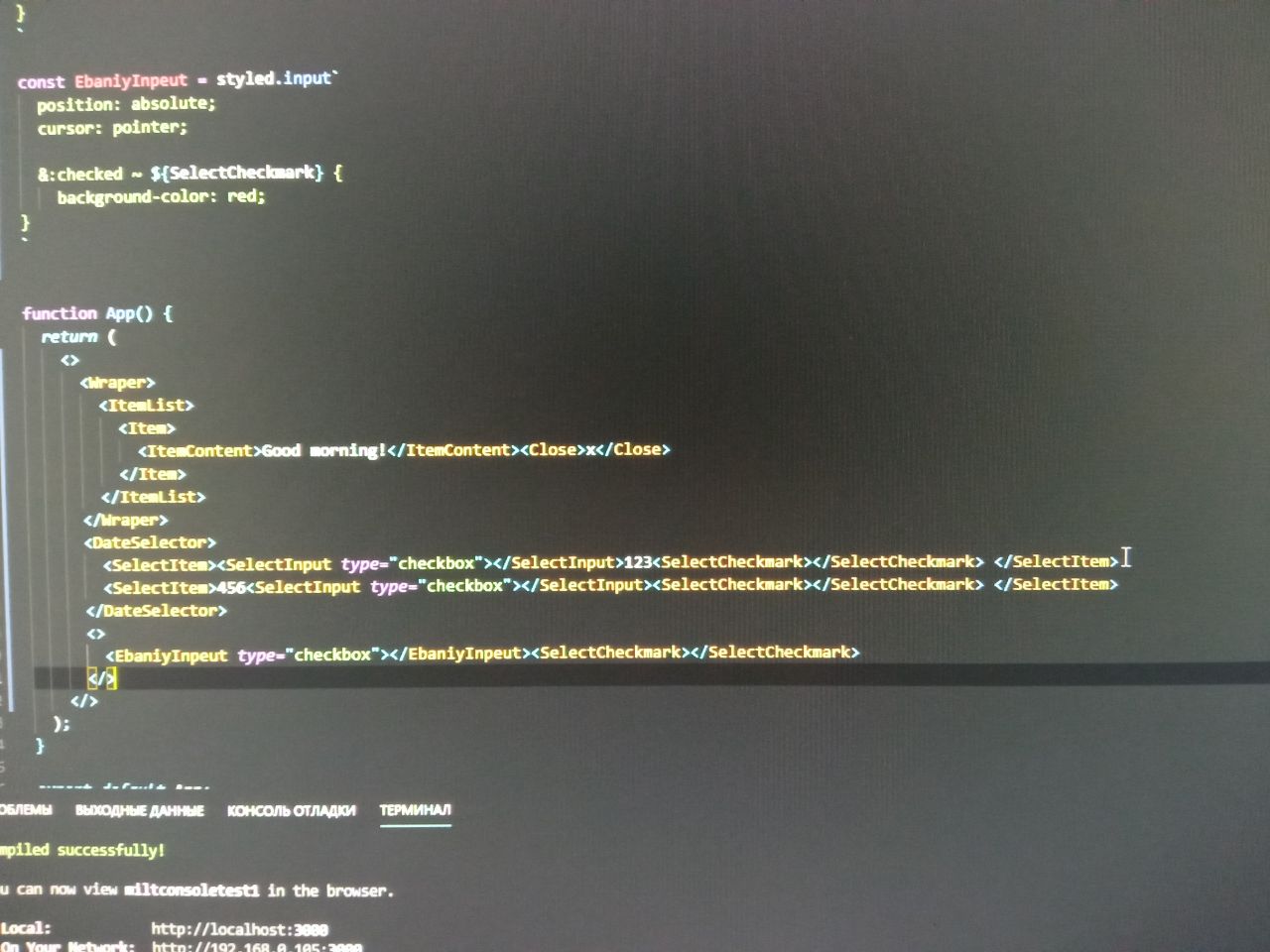
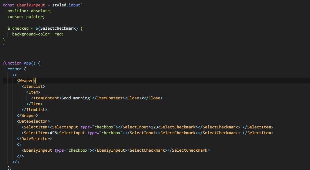
const EbaniyInpeut = styled.input`
position: absolute;
cursor: pointer;
&:checked ~ ${SelectCheckmark} {
background-color: red;
}
`
function App() {
return (
<>
<Wraper>
<ItemList>
<Item>
<ItemContent>Good morning!</ItemContent><Close>x</Close>
</Item>
</ItemList>
</Wraper>
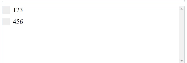
<DateSelector>
<SelectItem><SelectInput type="checkbox"></SelectInput>123<SelectCheckmark></SelectCheckmark> </SelectItem>
<SelectItem>456<SelectInput type="checkbox"></SelectInput><SelectCheckmark></SelectCheckmark> </SelectItem>
</DateSelector>
<>
<EbaniyInpeut type="checkbox"></EbaniyInpeut><SelectCheckmark></SelectCheckmark>
</>
</>
);
}
export default App;